15 Photography Tips To Make Your Photos More Attractive!
Nowadays, mobile phones and cameras have lower and lower requirements for photographers, as long as they press the shutter, they can shoot. But if you want to add your own thoughts to your photos, it is also very important to learn some photography knowledge. Today I will introduce several composition techniques, which may lead you to discover a new world of photography.
In fact, the doorway of composition is very many and very complicated. It not only includes the positional relationship of the subject in the picture, but also includes color, focal length, depth of field and many other aspects.
The composition I understand is how you arrange the content of your photos according to the theme of the shooting before shooting. It is to feel, manage the relationship, discover the structure, and let the meaning you want to express emerge in the space you create. Proper composition can better convey your self-expression about the world.
Here are a few common layout methods:
- Center composition
The central composition is to place the subject in the center of the picture to compose the composition, which is also a relatively safe and commonly used composition method. The advantage of this method is that it can highlight the subject, be clear, and find the balance point of the picture.
- Rule of thirds
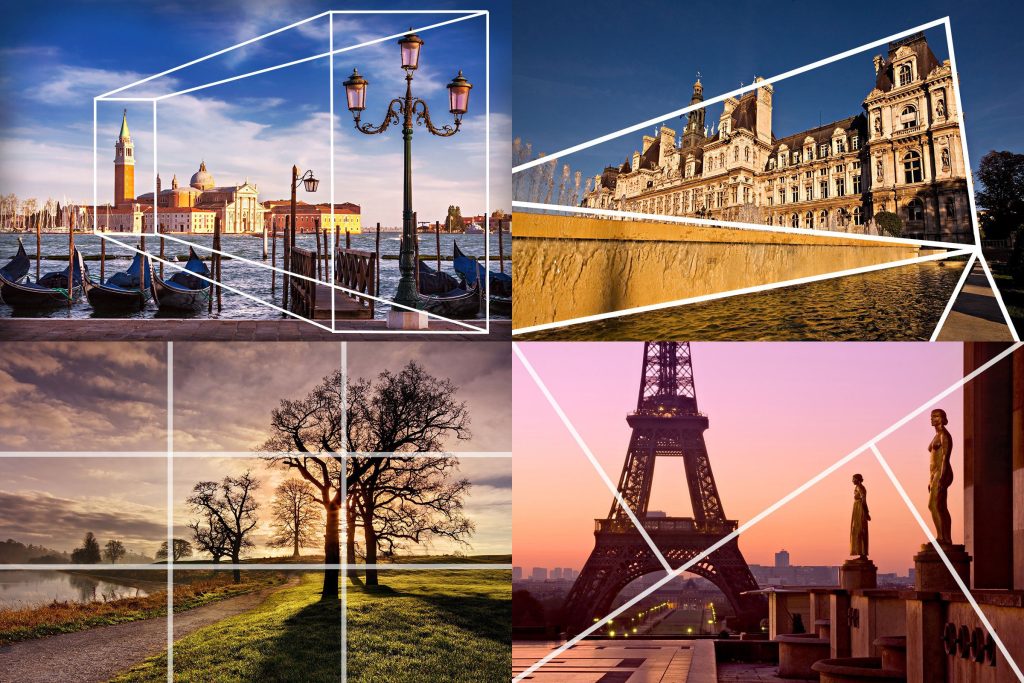
The rule of thirds is also a relatively common composition method. The picture is generally two lines horizontally and vertically, forming a “well” arrangement, dividing the picture into nine equal parts.
Many phones and cameras come with this type of composition guide. The intersection is the most attractive part of the picture, and placing the subject in this position is also the basic principle of thirds composition.
- Horizontal line composition
A straight line extending horizontally can make the picture look wider, more stable and harmonious. For example, the horizon and the horizontal plane separate the two spaces and give people more room for imagination.
So, what is a good position for the horizontal line? It also depends on the situation. For example, if you want to make the picture harmonious, you can choose one-third of the line of visual interest. If you have bright clouds in the sky, you can take more pictures of the sky. If the color of the clouds is monotonous and you want to highlight the scenery on the ground, take more pictures of the ground.
In addition, if you want to capture the reflection of a mirror on the water or lake, you can also place the horizontal line in the middle to enhance the sense of symmetry.
- Symmetrical composition
Speaking of symmetry, here is a fourth composition method. Symmetrical composition. Reminds me of the axisymmetric graphics I learned when I was a child. The symmetry here is to compose the image scene according to the symmetry or center of symmetry. Often used in conjunction with a central composition, where the subject is in the center of the frame.
- Frame composition
Framed composition uses the foreground frame to create occlusion and increase the depth of the picture.
When there is a difference between the foreground scene and the subject, the obvious contrast between the front and rear can also highlight the subject, observe things from a more novel angle, and make ordinary scenery unique.
- Guide line
Clear lines in the picture can attract attention and have an “eye-catching” effect. Leading lines are any form of lines in the picture, such as straight lines, curves, converging lines, parallel lines, spiral lines, etc., which can guide the audience’s sight. It can be used to create, enhance a sense of depth, etc.
In addition, the guiding lines are not necessarily specific lines, such as objects that are arranged or have a tendency to extend in a clear direction, such as walls, roads, and the same color or shadow.
- Diagonals and triangles
In composition, diagonal and triangular compositions are also often used. This not only enhances the geometric beauty, but also brings a dynamic tension.
- S-shaped composition (curve composition)
There are thousands of shapes in nature, among which the S-curve always gives people a soft and elegant beauty. It seems to be prolonged, changing, very rhythmic and rhythmic.
Like some large scenery, roads, creeks and rivers are more common.
The S-shaped composition can also be used for some curved elements with small radians. For example, when shooting beautiful women, S can be used to show the unique charm of the female figure.
- Prospect and sense of depth
The role of the foreground in landscape photography is still relatively strong. The main body is behind the foreground, and the entire space is elongated, becoming more three-dimensional, with a sense of depth and layering.
- Use empty space
“Leave three points of the painting empty, and the anger will follow.” Leave blank space in the frame to highlight the subject with a simple background. It can add more depth to the picture. This kind of blank space can also be combined with minimalist composition to give the viewer more room for imagination through less content in the picture.
- Golden Triangle Composition
The golden triangle composition is similar to the rule of thirds. It’s just that the straight lines here start from the four corners, forming two right-angled triangles on the left and right sides of the image. We want to place the elements of the picture at the intersection. This can make the picture richer, and multiple triangles are related to each other, echoing each other, and more interesting.
- Golden ratio composition
The ratio of the golden section was originally a mathematical law, and it also exists in large numbers in nature. This ratio is used more in painting and design. The golden ratio is 1:0.618.
In photographic composition, it is more advanced. The golden section point is expressed as a point on a vertical line on the diagonal, or a spiral line extending from a square with a side length of a radius.
But when shooting, if you have a hard time finding this position, you can use the Jiugongge composition, which is actually a simplified version of the golden section. Why do you say this? Let’s explain it with a set of data.
If the golden section line, the full length of the line segment is 1, the A line segment = 0.618, and the B line segment = 0.328, that is, the position of the golden section line is from right to left, and the value is 0.328.
Jiugongge, assuming that the full length of the line segment is 1, the position of one third is 1/3=0.333, and the position value of point C of the golden section line is 0.328, only a difference of 0.005. If you want to shoot more accurately, look at the lines on the left and the text on the right.
- Fill the screen
Filling the whole picture with the subject, without reserving space for the surroundings, allows the audience to focus on the subject, eliminate distractions, and remember more details.
- Repeat composition method
Repeated compositions, generally in specific situations. Such as fruit stands, flower bushes, or a wall full of windows. The content of the picture is to constantly repeat the subject to be photographed, and occupy the picture in a monotonous and repetitive way, which can also highlight the subject.
- Change the perspective
We often see many photographers lying on the ground when shooting, or some standing on the roof or higher positions to shoot. This is actually trying to shoot objects from a perspective other than the height of the human eye.
Now many cameras can flip the screen, you can try to shoot upside down. Lower or raise the angle of view, and you may find a different beauty in the subject.


Well, the above are several composition methods introduced. But in fact, when we are shooting, the most important thing is to think about and confirm the subject of the photo, the theme to be expressed, and the content to be conveyed to others. When shooting, think a lot, practice more, and combine some composition skills, so that you can master it and draw inferences from one case.


